Contact Forms are essential in almost every kind of website. Even the most simple website needs a form to establish a link between the website and its users. However, users tend to hate forms because they are large and uncomfortable to fill. It’s a tedious part when you want to send a message.
In this post, I will focus on contact forms because they are the most common among my clients and I consider it’s highly important for them to understand the importance of a form and how to do it properly. However, there are other types of forms like forms for subscribing to an email list, for buying a product, for register and so on. If you’re interested I can talk about them in another post.
A contact form is the last part, we tend to write and design every aspect of our website and we leave the forms until the end because it’s a tedious part for us as well, both designers and clients. However, this is a huge mistake because a contact form is the end of the user journey but it’s the most important one. If the user can’t fill the form or is unable to contact you, you will lose a client or a sale. That’s why we should care more about forms and design them carefully.
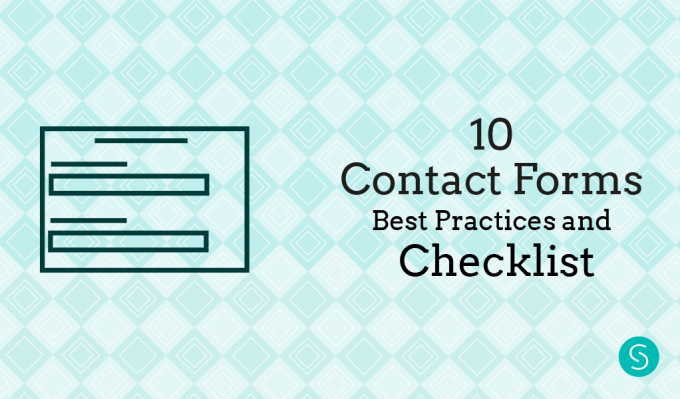
Contact forms best practices:
0: The form goal: Yes, there is a point number 0 because I consider it essential. Every form has a goal, you want to get something from it. You could want to have your client’s email, or their address, or their age. First of all, you want to think carefully which is the goal of your contact form. And the answer: “for my clients to contact me” it’s no right. You want your clients to contact you, ok, but for what? To ask for a quote? To ask some specific questions about your product or service? Think of it and write it down.
1: Keep it short: I have clients that want to collect all kind of information through the contact forms but they don’t realize that this is not recommendable because a lot of users won’t fill the form because they don’t want to give you that kind of information. For example, I see in a lot of contact forms the field telephone. Do you really need my telephone to answer my question? Or with my email, it would be enough? Most people doesn’t like to give their phone number to any stranger, so unless it’s a crucial point in your communication I will avoid this field.
Besides, you should ask only the essential information for that particular task (the goal that you define on point 0).
2- One Column: It’s better to use a one column structure because is faster to fill and faster to understand.
3- Don’t use placeholders: they are a trendy nowadays because they are beautiful and they afford space on the website but they are really bad for usability. You can read more about this here if you are interested.
It’s better to place the label first and below the input.
4- Buttons: The send button should be highlighted and should have a different style from the cancel button. There are two reasons for this; first of all, you want the user to send the message so it’s logical to give more importance to this button and, second, they should be very different because they make opposed actions so it’s important that the users understand the task for each one of them.
5- Copywriting: This point is crucial too. It’s very important to design a funny but also clear form. The users shouldn’t have to think a lot to fill it and if we are able to make him/she smile the better!
The texts on the buttons are very important too. If your form is for subscribing to your email list is better to write: Yes, subscribe me than send because the word send doesn’t mean the exact action that this contact form makes. In a nutshell, the text on the button should summarize the form goal.
6- Title and introduction: this point is related to the previous one. With the title you should make clear what is the purpose of this form, just to contact the company? For asking questions about a specific service? For subscribing to your list? Make it crystal clear. On the introduction you should explain a little bit more about the purpose of the form, or what you will do with the information and, in this section, you can add a bit of humour. Of course, it’s not necessary to write an introduction, a good and attractive title is enough.
7- Telephone field: if it’s crucial to ask the phone number make it easier for the user. With the input field define the structure of the phone. For example in Spain the structure would be three separate inputs.
8- Subject field: this usually is a conflictive point as well. Most of the times the user doesn’t know what to write here so again if it’s not necessary don’t ask for it. The subject label is very useful when you have different departments or different products and you want to simplify and filter your emails. But make sure that is easy for your user to choose the correct category.
9- Space: Between the label and the input should be little space and between each input should be a bigger space. This is to make it clear what label correspond to what input and not mix them up.
10-Capital letters: Avoid to write everything in capital letters because it’s more difficult to read and it takes more time. Use the capital letters only for the first letter of the word.
If you want to read more about the best practice in contact forms you should read this article from UXDesign.
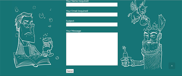
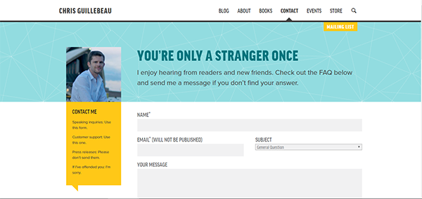
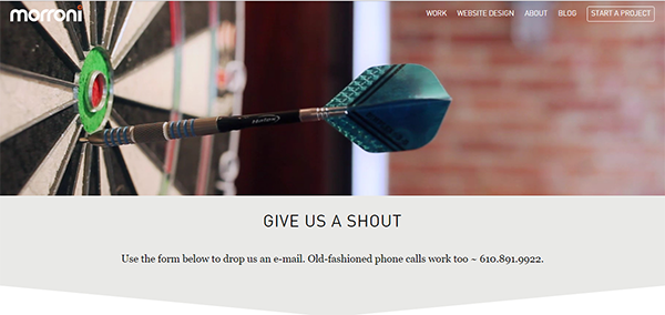
BONUS: Contact pages usually are short and a bit boring. Accompany the form with a photo that invites the user to send you a message. This photo depends on your company and your personality, it could be a friendly photo of your team or just a funny photo. Here you have some examples:
– You can use an illustration:
– Or you could be more classical and formal:
– Or use humour:
And what about you? Have you got a good contact form on your website? Download the Contact Form Checklist to verify it.
Let me know in the comments the results!