I know that graphic design could be difficult. It’s a wide range topic and some “rules” are subjective. So, if you don’t have any design skills but still want to have a good graphic presence on your social media, your website, or simply on the poster of your store, here I have some practical tips that will boost your graphics straight away.
Graphic Design Tips
1- Limit your typographies
It’s highly recommended to use at maximum two different typographies. And these typographies should be different. For example, you could choose one serif typography for titles and one sans-serif typography for body text, this is a great combination. A great advice too is to use the same family.
On a screen is better to use a sans-serif font for body text and on print is better to use a serif font for body text. Of course, there are exceptions and it depends on the length of your text and the topic but this is a general advice.
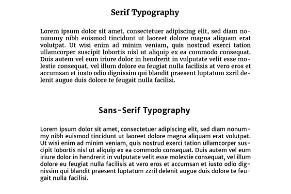
These are some common combinations that always work and all of them are free fonts:
1 – Merriweather – Merriweather Sans
2 – Open Sans – Roboto (sans -serif)
3 – Droid sans – Roboto (sans-serif)
4 – Noto serif – Noto Sans
5 – Noto serif – Open Sans
6 – Lato – Source Sans Pro
2- Limit your color palette:
It’s advisable to use only at maximum 3 different colors. Make sure that these colors match among them. To know this, you can use the chromatic circle.
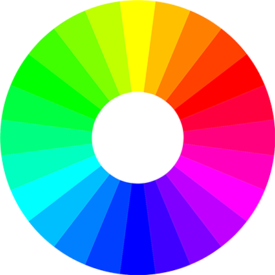
Also, Adobe Kuler is a great website that will help you to choose the right combination of colors.
3- Keep it simple:
Less is more. Keep your design simple. Every kind of design needs white space so, don’t fill all your design with elements. Better to have few elements that represent exactly what you want to convey.
4- Use contrast:
If you are going to print your design make a test first. Because sometimes on the screen your design looks pretty good but once you print it, it doesn’t have enough contrast. If you are using it on screen, make sure that there is enough contrast. Don’t be afraid of using it.
5- Use a Mood Board:
I use them in every kind of design I make, as I explained on my corporate identity design workflow and my corporate website design workflow. Before start designing anything think about textures, colors, typographies that represent your topic and concepts and put them together on a white sheet. If it helps, you can print it and have it in front of you throughout the whole design process.
This little exercise will help you to clarify the aesthetics of your graphic. And when you will start designing you will be faster and you will have more clear what you have to do.
6- Research and look for inspiration:
Don’t copy. Be original and creative. But for being original you need to know what other people did or are doing. So before starting, make a little research about your topic, see other posts or blogs, other graphics.
A good advice is that you can see other things that are not related to your topic. For example, if you are going to design a graphic for facebook, it could be useful to see magazines, websites, posters, books…. These could be an inspiration too, you would be surprised.
You can find inspiration here:
– Dribble
– Behance
– Pinterest
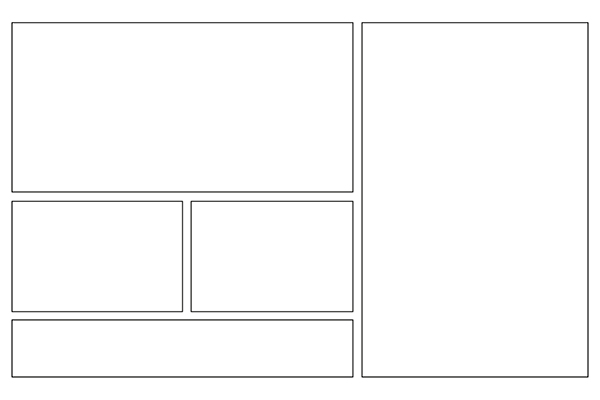
8- Use a grid:
A grid could seem outdated to some of you, but it really helps to order your elements. Especially a lot of photos. Don’t place them at random. For text, is very useful too. Good website designs are based on grids, so it can’t be so bad.
9- Details matter:
Paying attention to details can be the difference between a good design and a great design. Don’t run. Design your graphic, then take a rest and come back to it a day or two later. This will help you to have another point of view. If something looks strange, something is not exactly at the center, fix it. Maybe you could think that nobody will see it, and it’s possible, but still your design will look “strange” and everyone will have this feeling.
10- Don’t center everything:
Most people tend to align center every single element in their designs. It’s not advisable because it’s uninteresting to look at. Align your elements to the left and see what it looks like.
BONUS:
11- Don’t use shadows or gradients:
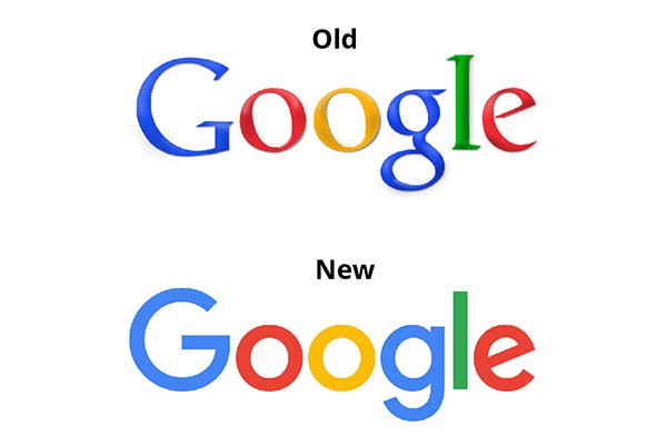
They are outdated and they don’t look good. They are not simple as I said before that your design should be. Think that the most important companies redesign their logos recently and they removed the gradients and volumes. Like for example, Google.
I hope these tips will help you to improve your graphics from now on!
Did you know these tips? Which kind of design tips do you apply to your designs? Let me know in the comments!