People have a tendency to follow trends, just only because everybody uses them and it’s modern! However, before using a trend, whatever it is, you should ask yourself if it’s aligned with your business and philosophy.
Of course, your website should be modern, it’s awful to see nowadays a website with a 90’s style. But having a modern website and having and inconsistent website just full of trends is another. Besides, a website that just follows all the trends is less usable and less intuitive.
But after all is important to know them, because that way we can know if there is some trend suitable for our business, especially if we are going to redesign our website this year. For example, I’m redesigning my own website, so this information is very valuable.
Web Design Trends for 2017
1 Less Stock photos, more realism
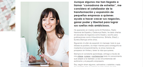
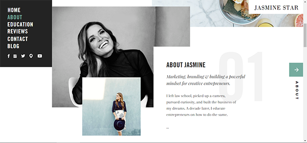
I always advised people to take their own photos for their websites. It doesn’t matter if you don’t have a luxury and big studio or company, the realism is more important than beauty. When you have realistic photos on your website the user will trust more on your company and will be more willing to buy your product or service. Because if you only have stock photos or no photos at all, it could be because of something, right? It seems that you are hiding something.
This year the general trend is more originality and realism so we can expect a less use of stock photos. Besides, team photos (real ones) are very popular nowadays.
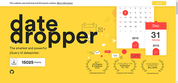
2 Big Typography
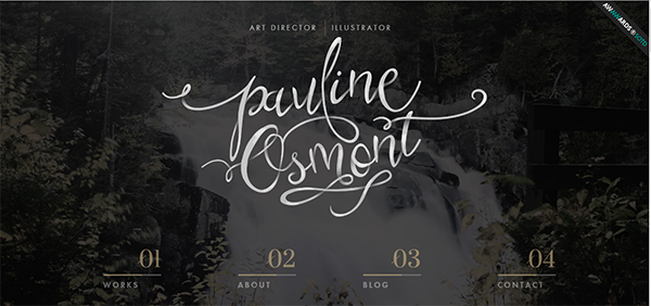
Typography is gaining in popularity recently. Especially creative typography. It’s a core part in any kind of design.
In web design is being used in home pages mostly to grab the user attention.
3 Minimalism
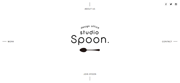
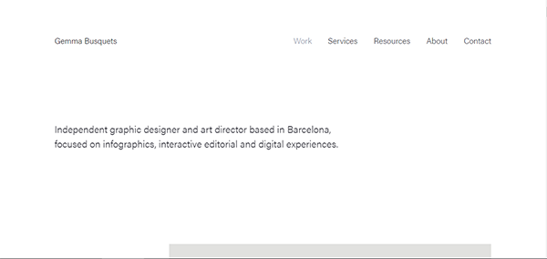
For a few years, minimalism is a trend and this year it going to continue. Less is more and in web design and digital experiences are even truer. Don’t overcharge your website with useless content or graphics just only to have something full or “beautiful”. The same apply to animations. They are also a trend nowadays but use them with taste and only for details.
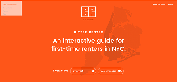
4 Bright colours
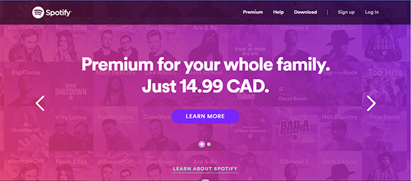
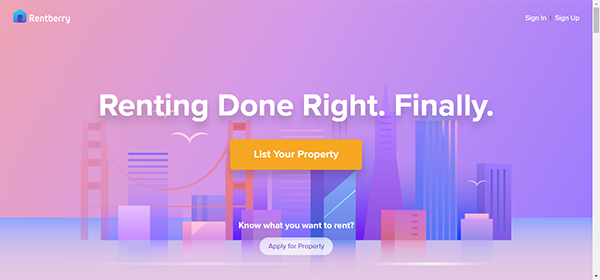
In 2017 bright colours and contrast will be very important.
An easy example is the Spotify redesign, they redesigned the whole corporate image. At the beginning, they used green as their corporate colour and now they have a more colourful image.
Even it will be a trend to use a full-colour background on home pages.
5 Full-screen Video
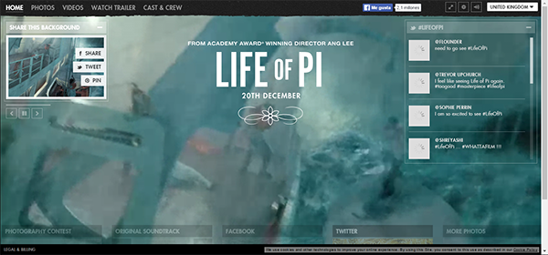
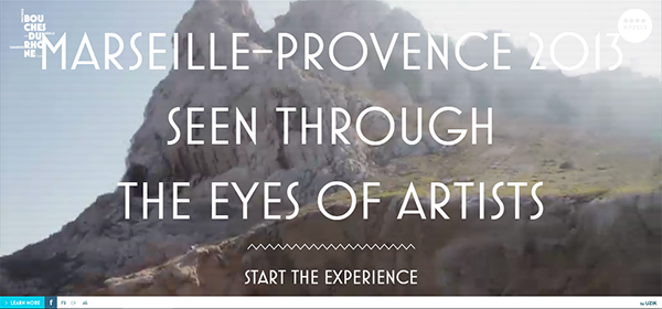
The images always were very important in a website. It grabs the user attention and if they are good they improve the visual quality of the site. However, now the video it’s increasing.
In 2016 the video becomes highly important in almost every digital marketing strategy. And this year will not be less.
Full- screen videos and immersive experiences will be the trend. Of course, you should have a high quality and original video to show.
Videos improve the engagement and grab the people attention. Besides, generally, people prefer to watch a video instead of reading a long post or article.
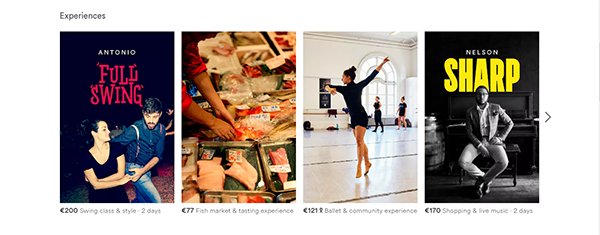
6 Cards
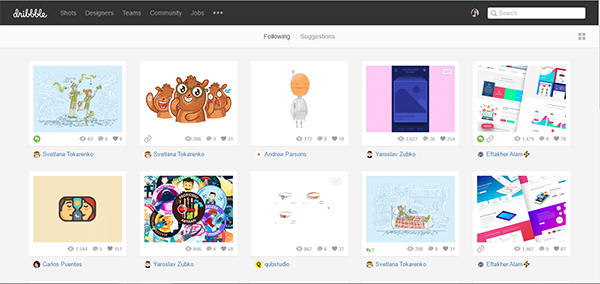
Cards become a trend with the mobile designs and especially, in APPs. But recently, they are being used in web design also. They are great and also elegant and minimalistic.
7 Material Design
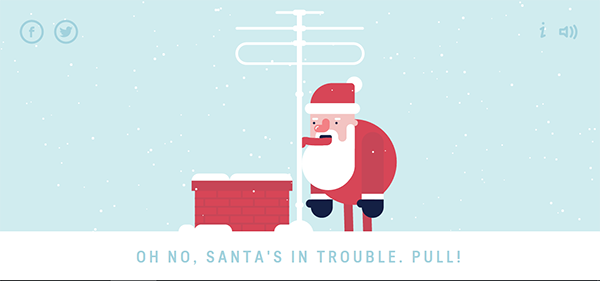
Google developed Material Design and at the beginning, it was only for mobile designs and especially, on Google APPs. But now, is increasing in popularity and we can see it even on websites.
Conclusion
As I said at the beginning, there are thousands of trends, not only in web design, there are in every field and is important to know them. But, more important is to know which of them use in your business because you have to maintain your corporate image and philosophy. It doesn’t matter if big typography or material design is a trend nowadays, if it doesn’t fit with your style, don’t use them.
Will you follow any of these trends on your website this year? Let me know in the comments!

